Social Media Typography: Mastering Cursive Fonts for Engagement
The ordinary text flooding our social media feeds competes for attention in a crowded digital landscape. When your message gets lost in the noise, even the best content goes unnoticed. Have you ever wondered how to make your posts stand out without spending hours on professional graphic design? This guide shows you how to use cursive typography to make your social media presence pop.
By using a cursive generator, you can create content that stops the scroll. It captures engagement through strategic visual hierarchy. Using professional design principles shouldn't be hard. Whether you are an influencer, a small business owner, or just someone who loves aesthetics, understanding typography is the key to digital success. This article will show you how to use stylish fonts to build a brand that people remember.

Mastering Cursive Font Pairing for Maximum Impact
Effective design is rarely about using just one font. It is about how different styles work together to tell a story. When you use a cursive font pairing strategy, you create a balance between elegance and readability. This balance makes a layout look professional rather than cluttered. It ensures that your audience can enjoy the aesthetic without getting confused by the message.
The Psychology Behind Cursive Font Selection
Typography is more than just "pretty letters." It carries deep psychological weight. Cursive fonts often represent elegance, creativity, and a personal touch. Because cursive looks like human handwriting, it feels more intimate and trustworthy to the reader. It creates a bridge between the digital screen and the human hand.
Using a fancy text generator for your headlines sends a message to your audience. It shows them that your brand is sophisticated or artisanal. However, different cursive styles send different messages. A sharp, slanted script might feel fast and energetic. In contrast, a rounded, flowing script feels calm and romantic. Understanding these subtle cues helps you choose the right style for your specific message.
Combining Cursive with Sans-Serif: A Designer's Approach
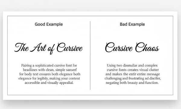
One of the most important rules in typography is contrast. Using two different cursive fonts together often creates visual clash and makes text hard to read. Professional designers avoid this by pairing a decorative cursive font with a clean, simple sans-serif font.
Sans-serif fonts like Arial or Helvetica look modern and are easy to read. Pairing a script font for your main title with a sans-serif for details creates a clear visual path for readers. You can style your title and place it directly into your design tool or social media app. Then, use the standard platform font for the secondary information. This combination ensures your "hook" is beautiful while your "info" remains clear and accessible.
Avoiding Typography Clashes: Common Mistakes to Sidestep
The most common mistake beginners make is overusing decorative fonts. If every word in your Instagram post is in a complex cursive style, the human brain will struggle to process the information. This results in "visual fatigue." When this happens, users will simply keep scrolling past your hard work.
Another mistake is ignoring legibility. Some cursive fonts are very artistic but difficult to read on small mobile screens. Always test your text before posting. If you can’t read it at a glance, it is time to simplify. Using a cursive text generator allows you to preview different styles instantly. This makes it easy to pick one that is both beautiful and highly readable for your followers.
Visual Content Strategy: Creating Hierarchy with Cursive Typography
A successful visual content strategy relies on a concept called "typographic hierarchy." This is the order in which a user processes information. Without a hierarchy, every part of your post competes for attention. The viewer won't know where to look first, leading to a higher bounce rate for your content.
Size, Weight, and Spacing: Building the Perfect Typographic Pyramid
To build a typographic pyramid, you must vary the size and weight of your text. Your primary message—the headline—should be the largest and most distinct. This is the perfect place for a bold cursive font. It acts as the "hero" of your design and grabs the viewer's eye immediately.
The second level of the pyramid is the sub-headline. This should be smaller than the headline and usually in a different weight. Finally, the body text should be the smallest and most legible. By using a script fonts generator, you can easily create these different levels. Spacing is also vital. Giving your cursive text "room to breathe" prevents the design from feeling cramped and messy.
Color Psychology in Cursive Typography for Social Media
Color and typography work hand-in-hand to trigger emotions. A gold cursive font on a dark background suggests luxury and high-end service. On the other hand, a bright pink or teal script might feel playful and youthful. The colors you choose should always complement the "personality" of the font itself.
When applying cursive typography to your social media graphics, consider your brand's color palette. Ensure there is enough contrast between the text color and the background. If your cursive font is too close in color to the background, it will lose its impact. Use the online cursive tool to generate your text. Once you have the right style, apply it to your colorful layouts to see how the contrast helps the words jump off the screen.
Strategic Text Placement: Where to Use Cursive for Maximum Engagement
Where you put your text is just as important as how it looks. On platforms like Instagram and TikTok, the center of the image is usually the "sweet spot." However, for many designs, placing a beautiful cursive quote in the upper third of the image can create a more artistic feel. This leaves the center open for the subject of your photo or video.
Avoid placing important text near the edges of the screen. Platform icons like the "like" heart or "share" arrow might cover it up. Use cursive for short, punchy phrases like "New Arrival," "Link in Bio," or "Sale." These short bursts of stylized text guide the user's eye exactly where you want it to go. Following these text layout tips will significantly improve your engagement rates and make your feed look professional.
Instagram Typography Design: Platform-Specific Applications
Instagram is a highly visual platform where Instagram typography design can make or break your profile's growth. Because the platform's default fonts are limited, using external tools to customize your text is a great way to differentiate yourself. It helps you build a unique identity in a sea of identical-looking profiles.
Crafting Irresistible Instagram Bios with Cursive Typography
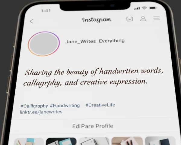
Your Instagram bio is your digital business card. It is the first thing people see when they click on your profile. Using a standard font is fine, but using a cursive font for your name or your brand's tagline can make a powerful first impression. It adds a layer of sophistication that standard text lacks.
How do you do it? Simply go to a fancy fonts generator, type your name, and choose a style you love. Copy the result and paste it into your profile settings. This small change makes your bio look curated and high-effort. It signals to potential followers that you care about aesthetics and detail, which builds trust and interest.
Storytelling with Cursive Text in Instagram Stories
Instagram Stories are meant to be fast, engaging, and personal. Cursive fonts are perfect for Stories because they add a "journal" or "scrapbook" feel to your photos and videos. Whether you are sharing a "Day in the Life" or a "Behind the Scenes" look, a script font adds that necessary touch of human personality.
Since Stories move quickly, use cursive for the emotional parts of your story. For example, use it for words like "Dreamy," "Obsessed," or "Thank You." This keeps the vibe light and artistic. You can use a cursive writing tool to create these words and then upload them as overlays to your story clips for a custom look that the built-in Instagram fonts can't match.
Captivating Captions: Balancing Readability and Style in Instagram Posts
Captions are where you provide value and context. While you might be tempted to make the entire caption cursive, remember the rule of legibility. The best way to use cursive in captions is to highlight the first line or a specific call to action (CTA). This draws the eye to the most important part of your written message.
By using stylized text for the first sentence, you create a visual "hook." This encourages people to click "more" and read the rest of your post. This balance of style and readability ensures your message is heard. Your brand will be remembered for its unique and polished look.
Elevate Your Social Media Presence with Strategic Typography
You don't need to be a design pro to make your social media pop. With the right cursive fonts and our easy-to-use generator, anyone can create eye-catching content in seconds. By understanding cursive font pairing and the psychology of design, you can transform a simple sentence into a powerful brand statement. Remember to maintain a clear hierarchy and keep an eye on legibility.
Visual hierarchy tells your audience what is important, and cursive fonts provide the emotional connection they crave. Ready to level up your social game? Our cursive generator makes it fun and easy to transform your text in just a few clicks! Whether you are updating your bio or designing your next big post, the right font is waiting for you. Try giving your text a fresh makeover and see how it impacts your community!
The Takeaway
How do I make my Instagram bio stand out with cursive fonts?
The best way is to use a cursive name generator to style your display name or your primary tagline. By replacing the standard, plain text with a unique Unicode script, you create an immediate visual point of interest. This sets you apart from the millions of other accounts using the default settings.
What's the best way to pair cursive fonts with regular text?
Follow the "Opposites Attract" rule. Pair a highly decorative cursive font with a very simple, clean sans-serif font. Use the cursive for the "Hero" text, such as titles or hooks. Use the regular text for the supporting details to ensure everything remains readable.
Can I use cursive fonts in all my social media posts?
You can, but moderation is key. Cursive is most effective when used for emphasis. If you use it for every single word, it loses its impact and becomes hard to read. Use it for headlines, quotes, or keywords to ensure your visual content strategy remains effective.
How do I ensure my cursive text remains readable on mobile devices?
Always check the "weight" of the font. Some thin scripts disappear on bright backgrounds or small screens. Choose a script that has a bit of thickness if you are placing it over a photo. Using a cursive font generator allows you to see a live preview. This makes it easy to judge the readability before you copy and paste.
Are there specific cursive fonts that work better for certain social media platforms?
While Unicode fonts work across most platforms, bold script styles often work best for Instagram and TikTok. They are thick enough to be seen clearly on mobile devices. For professional platforms like LinkedIn, a more subtle, elegant script used sparingly in a headline can add a touch of personality. Experiment with different styles to see which one fits your platform's specific vibe.