Readable Cursive Text for Bios and Invites
Cursive text looks elegant when it feels intentional. It becomes hard to use when the style takes over the message. That problem shows up fast in short public text such as bios, invitations, greetings, and names.
Most users do not need the fanciest possible output. They need a result that still feels clear after it is pasted into a profile, heading, or event line. A stylish phrase only works if the reader can still understand it at a glance.
That is why a quick cursive text generator works best when it is paired with a readability check. This article explains where decorative text helps, where it starts to fight the message, and how to keep the final result elegant without losing clarity.
Disclaimer: The information and assessments provided are for educational purposes only and should not replace professional medical advice, diagnosis, or treatment.
Why beautiful cursive text can become hard to read
Generated cursive text is often strongest in small doses. A single name, short greeting, or lightweight title can feel polished and memorable. Once the text gets longer, each decorative letter asks the reader to slow down.
That is not a problem with the generator itself. It is a design choice problem. Users often copy a style that looks beautiful in isolation, then discover that the same look feels crowded inside a profile bio or formal invitation line.
The safer approach is to treat decorative cursive as an accent. The site's cursive style preview tool gives fast options, but the final choice should still depend on where the text will live.
Where readability matters most in short public text
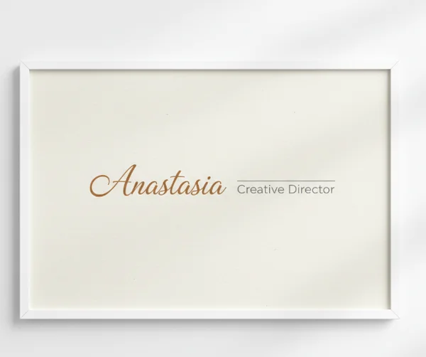
Bios, names, and short labels
Short labels are where cursive text usually shines. A profile name, short bio tag, or greeting line has less text to decode, so the style can stay visible without turning into a reading task.
The [U.S. Web Design System typography guidance] says body text should be at least 16px on desktop and 15px on mobile for readability. That matters because stylish text that already feels delicate can become much harder to read when it is squeezed into a tiny profile field.
This is why names and short labels work better than detailed descriptions. A brief phrase gives the style room to feel intentional. A crowded line forces the reader to work harder than the situation deserves.
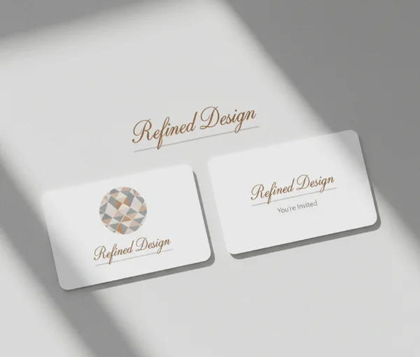
Invitation headings and greeting lines
Invitations are another strong fit because the most decorative text is usually limited to names, dates, or short opening lines. That keeps the cursive effect focused on tone instead of pushing every sentence into the same visual role.
A heading can carry more flourish than supporting details. The supporting lines still need quick readability for location, timing, or RSVP information. In practice, the most polished invitation layouts use decorative text as emphasis, not as the only voice on the page.
This is also why many users get better results by generating one elegant headline, then pairing it with plain body text outside the tool. The generator supports the moment best when it handles the memorable line, not the full layout.
How to balance style, contrast, and text length
Why shorter phrases usually work better
Shorter phrases keep decorative letters from piling up. That matters because the U.S. Web Design System notes that long chunks of italic or uppercase text are more difficult to read. Cursive-style text can create a similar effect when too many decorative characters appear in one block.
USWDS also says readable line lengths usually fall between 45 and 90 characters, with an ideal average around 66. That is a useful reminder that cursive generator output works best for short names, greetings, titles, and single-line accents rather than long paragraphs.
If a phrase already feels busy at 1 line, it will rarely improve when expanded to 3 or 4. A shorter phrase usually looks more elegant because the style has room to breathe.
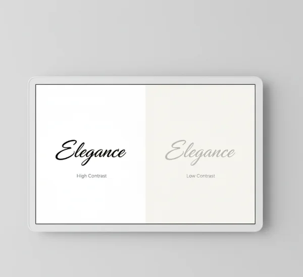
Contrast and spacing checks before you copy
Readability is not only about the letters themselves. Color, background, and spacing matter too. A graceful script can still fail if the text fades into a photo, pastel background, or low-contrast card design.
The [U.S. Web Design System accessibility tests page] says body text needs a 4.5:1 contrast ratio, while large text can use 3:1. Even without a formal design system, the rule suggests one simple habit. Check the generated cursive text on the real background before copying it into the final piece.
A good test is quick. Step back, read the line once, and ask whether the words are obvious without effort. If the answer is no, the problem may be contrast, not style.
A simple generator workflow for cleaner results
Generate, preview, then paste
The fastest way to avoid messy output is to add one extra step before pasting. Generate the phrase, preview it in the real destination, then decide whether it still works there.
That preview matters because a style that feels elegant in the generator may feel cramped in a social profile, event title, or label. A cursive text copy workflow is strongest when users test one line at a time instead of styling everything at once.
This also keeps revisions small. If one phrase feels too dense, it is easier to shorten it, switch styles, or fall back to plain text before the whole design is committed.
When to switch back to plain text
Switching back to plain text is not a failure. It is often the better design move. If the message contains details, instructions, or more than one key idea, plain text usually serves the reader better.
Decorative cursive works best when it highlights mood, identity, or emphasis. Plain text works better when the reader needs to absorb information fast. Knowing the difference is what makes generator output feel polished instead of overdecorated.
That balance is part of the tool's value. The site helps users find elegant text quickly, but the smartest result is often the one that uses just enough style for the setting.
Next steps for elegant text that still reads clearly
Readable cursive text is usually short, visible, and used on purpose. Names, greetings, bios, and invitation headings are strong places to use it. Long explanations, dense details, and low-contrast layouts usually are not.
That is why the cursive text generator homepage works best as a quick testing space. Generate the phrase, preview it in context, and keep the message as clear as the style. When elegance and readability stay in balance, the result looks more polished and feels easier to use.
If visual readability problems become severe or persistent, seek professional help from a qualified educator, accessibility specialist, or healthcare provider instead of relying on online information alone.